
Creative Color Schemes for Design Projects: Transforming Your Vision into Vibrant Reality
Color is not just a visual phenomenon; it’s an emotional experience. Imagine stepping into a room where the walls pulse with hues that celebrate the vibrancy of life. Now, think about your design projects. Are you leveraging color’s full potential? The choices we make around color can elevate our work from mundane to extraordinary, and it’s time to challenge traditional thinking about color schemes.

From Personal Experience to Universal Application
When I first started my journey in design, I relied heavily on what the textbooks taught me: primary colors and ineffectual pairings. However, my perspective shifted during a pivotal project where I experimented with an unconventional palette inspired by nature. The project not only captured attention but also ignited conversations about the emotional weight that color carries. This realization is not just personal; it resonates across various industries. Color choices can evoke feelings, influence decisions, and forge connections on a psychological level—not just aesthetically.
Challenging Conventional Wisdom
We’ve all heard the adage, “Less is more.” But what if we flip that notion? Instead of stripping our designs down to mere basics, why not infuse them with layers of color that reflect complexity and depth? For instance, the monochrome schemes popular in minimal designs might default to safe choices but often miss the opportunity for vibrancy that color can bring. Instead, we could explore rich gradients, unorthodox combinations, or even mood-based palettes that cater to the narrative of the project. This shift in thinking can transform a simple design into a storytelling platform.
Interdisciplinary Insights
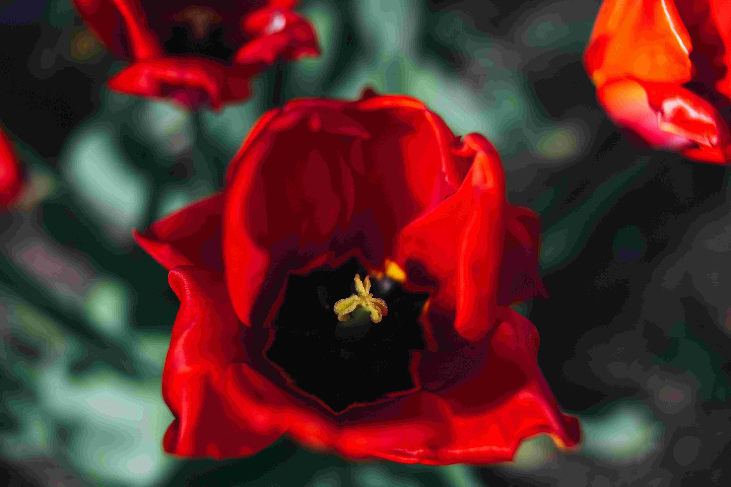
Drawing from interdisciplinary sources can yield groundbreaking design solutions. Psychology teaches us that different colors evoke varied emotional responses. Take red, a color synonymous with urgency and excitement, while blue conveys tranquility and trust. Integrating this knowledge into our color selections can enhance user experience in fields like tech, where the color scheme can influence user engagement. Additionally, if we look to nature’s palette, we find harmony in unexpected color blends that can inspire designs infused with life and vibrance.
Future Trends in Color Design
As we look to the future, technology and culture are influencing color trends more than ever. With the rise of AI-driven design tools, we can predict that color schemes will become more personalized through user data. Imagine designs that adapt dynamically to the emotional state of a user. Moreover, with increasing consciousness around mental health, colors that promote well-being will likely gain popularity. Projects may increasingly include serene palettes designed to foster comfort within environments like workspaces or public areas.
Practical Steps to Craft Unique Color Schemes
To create color schemes that stand out, consider these actionable steps:
-
Research Color Psychology
: Understand how colors affect emotions and behaviors. This knowledge can guide your choices based on your project’s goals. -
Create Mood Boards
: Assemble images, textures, and colors that inspire you. This visual exploration will help clarify your vision. -
Experiment with Palettes
: Use online tools to test different combinations. Platforms like Adobe Color can assist in finding complementary colors. -
Seek Feedback
: Gather opinions from peers or clients. Diverse perspectives can enhance your design and provide insights you hadn’t considered. -
Stay Current
: Follow emerging trends in color theory and design. Subscribe to design blogs, attend webinars, or join forums to stay engaged in the conversation.
Vivid Metaphors for Color Complexity
Color choices in design can be likened to the orchestra in a symphony; each shade plays its role, contributing to the overall harmony. A single note, or color, might sound beautiful alone, but it’s the interplay of various notes that creates a masterpiece. Therefore, think of your designs as dynamic compositions, where each color not only stands out but also complements and enhances others to craft a rich narrative.
Emphasis on Continuous Learning
In an ever-evolving design landscape, it is crucial to embrace continuous learning. The next big trend could emerge from the most unlikely source, be it a piece of literature, art, or nature. Engage with diverse fields, attend workshops, and immerse yourself in new experiences. This not only fuels creativity but also enriches your understanding of color as a conceptual tool.
Encouragement to Take Action
As you ponder your next design project, I implore you to take action! Don’t settle for conventional color choices. Dive deep into what colors speak to you and your audience. Learn the principles of color theory and explore the emotional impacts tied to different shades. Experiment boldly with your palettes and trust your instincts. Remember, the only limit is your imagination.
Fostering Critical Thinking in Design
Finally, as designers, it is our responsibility to approach color selection with critical thinking. Don’t succumb to fleeting trends without questioning their relevance to your project. What message do you want your color scheme to convey? Are you perpetuating stereotypes or breaking boundaries? Make deliberate choices that reflect not only your vision but also the values you want your design to embody.
Coming Full Circle
As I reflect on my journey with color in design, it becomes evident that we have the power to influence emotions through every choice we make. Much like the initial powerful statement, understanding that color transcends aesthetic appeal places us at the forefront of change in our designs. So, as you embark on your next project, remember that through vibrant color schemes, you have the power to breathe life into your vision and connect deeply with your audience.


